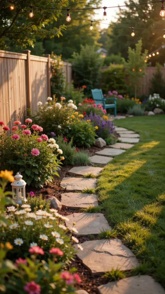
Why Color Matters for Your Garden Crafts
If you have ever walked into a garden center and felt overwhelmed by all the painted pots, rusty metal sculptures, and wooden signs, you are not alone. The secret to making your own outdoor projects look intentional (instead of chaotic) is using garden art color palettes. A palette is just a small set of colors that work well together. Think of it like a recipe. You pick two, three, or four colors and use them over and over on your pots, birdhouses, and garden stakes. Suddenly everything in your yard or patio starts to feel connected. No prior experience needed. You can learn this in an afternoon.
Color palettes do not have to be complicated. Most people start by noticing what already exists in their garden: the green of the leaves, the brown of the fence, the red of a brick wall. Then they pull two or three shades from those surroundings. That is how you get a cohesive look without spending money on new plants or furniture. The best part is that you can try different color combos for free before you commit to painting anything permanent.
Start Simple: Pick One Main Color Family
The easiest way for a beginner to choose garden paint colors is to stick with one color family. Are you drawn to warm oranges, yellows, and reds? Or do you prefer cool blues, greens, and purples? Pick a family and stay inside it for your first project. If you love warm tones, try terracotta orange, mustard yellow, and a soft cream. If cool is your style, go with slate blue, sage green, and white.
Once you have a few colors from the same family, add one neutral like black, white, or gray. That neutral gives your eye a place to rest. It also makes the bright colors pop without feeling loud. For example, a bright coral pot looks much better when it sits next to a matte black garden stake. The contrast is clean, not chaotic.
- Warm family example: terracotta, golden yellow, cream, charcoal gray
- Cool family example: dusty blue, mint green, pale lavender, off-white
- Neutral family example: warm beige, brown, olive green, black
Real Palettes That Work: Jewel Tones and Earthy Hues
If you want something dramatic, try jewel tones for garden art. These are deep, rich colors like emerald green, sapphire blue, amethyst purple, and ruby red. They look fantastic on painted metal sculptures because the glossy surface catches the sunlight. A small metal dragonfly painted in jewel tones can become the focal point of a flower bed. Pair jewel tones with a dark base like navy or black so the bright colors do not compete.
On the other hand, if you prefer a calm, natural look, go with earthy hues for hand painted pots. Think clay brown, moss green, warm taupe, and dusty rose. These colors blend right into a garden setting. They do not fight with the flowers. I have a set of terracotta pots painted in dusty rose and sage green, and they look like they have been there for years. Earthy tones are also forgiving if your paint job is not perfect. A little brushstroke unevenness just adds character.
Paint Type Matters: What Works on Metal, Wood, and Terracotta
Not all paint sticks to every surface. Before you start, know what you are painting. For best paint for outdoor garden crafts, here is a quick breakdown. On metal (like old tools or wire sculptures), use spray paint made for metal and outdoor use. It bonds better and does not chip as easily. On bare wood (birdhouses, signs, garden
#gardenart #colorpalette #gardencrafts #DIYhome #outdoordecor
Leave a Comment