Here’s the thing about outdoor decor: most people think about what to put in their yard, but hardly anyone thinks about how it moves. That’s where the magic happens.
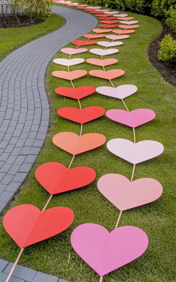
I spotted a curved garden path recently that completely changed how I look at lawn art. The walkway itself was nothing fancy, standard gray interlocking pavers. But the hearts? They ran along the curve in a deliberate red to pink gradient, starting bright and bold at the bottom left, fading into soft blush by the time the path swung right. It hit me then: you can buy the cutest decorations on the internet, but if you place them in straight lines, you are actively fighting the landscape. A curved garden path needs accents that follow the flow, not ignore it.
This guide is for the complete beginner. I’m not assuming you know anything about gradients, stakes, or paver patterns. I’m just assuming you have a yard, a little bit of patience, and a desire to avoid the sad, disconnected look that happens when you just stab hearts into the grass without a plan.
### The Common Heart Art Mistake You Need to Fix Immediately
Look, I get it. We see those paper heart sets online, and the natural instinct is to line them up like soldiers. We think, “Well, I have six hearts, so I’ll space them evenly down the edge of the lawn.” That is the mistake.
When you plant heart garden art in a straight line next to a curved pathway, you create an optical illusion. The curve looks messy, and the hearts look stiff. It’s like hearing a jazz song played with a metronome. It works, but it feels robotic. The eye gets confused because the path is telling you to flow, but the art is telling you to stop.
Instead, your heart garden art should act like the path’s shadow. It should echo the movement. If the path bends right, your hearts should stagger to the right. If the path dips, the hearts should lower their height slightly. You are not just placing decorations; you are tracing the line of the walkway with color.
### How to Plan the Color Fade Before You Stake a Single Heart
Go buy butcher paper or just use printer paper and colored pencils. Map out your curve on paper first. It sounds nerdy, but honestly, it saves you a lot of moving stakes in the yard.
For the gradient effect in the photo, you need three shades: a true bright red, a mid-tone coral or rose, and a soft baby pink. The ratio matters. You don’t want an equal split. You want a heavy concentration of red at the start, a quick transition, and then a long tail of pinks.
Here is the thought process you should walk through on site:
– **Walk the path.** Stand at the start (the bottom left in the photo) and look toward the end.
– **Mark the “hot zone.”** Place your red hearts where the path enters the view.
– **Mark the “cool zone.”** Place the pale pink hearts near the visual exit point, usually where the path meets a bush or a corner.
– **Remember the rule of three.** Grouping three hearts close together with a slightly larger gap before the next cluster always looks more natural than single, lonely stakes.
Think about the color fade like a story. The red is the introduction, full of energy. The pink is the conclusion, soft and quiet. You want the eye to travel the whole story without getting stuck.
### Making the Hearts and Choosing the Right Rods
Ok so, the hearts in this specific installation are paper, which is fantastic because it costs almost nothing. I know the AI image description says they are mounted on thin metal rods, and that is the way to go.
Do not use wooden dowels. They wobble in the wind and rot after two rains. Thin metal rods, around 3/16 of an inch thick, are invisible from a distance and push easily into most soil.
To attach the paper hearts, you have two options. You can cut a small slit in the back of the paper and slide the rod in, or you can use a hot glue gun to fix the rod to the back. Gluing is better because it keeps the heart facing forward toward the path.
One weird thing I discovered: if you use glossy paper, the sun creates a terrible glare. You cannot see the color gradient from 10 feet away because it just looks like white blobs bouncing light. Use matte paper. It costs the same, but the color saturation is ten times better.
### Why the Proximity to the Paver Pathway Matters So Much
Here is where beginners really drop the ball. They place the art way too far away from the hardscape. The hearts end up looking like they belong to a different yard entirely.
In that perfect photo reference, the paver pathway is the anchor, and the hearts hover right along the edge of the grass line. You want the stakes to be about 12 to 18 inches off the edge of the pavers. That distance is close enough to connect the two elements, but far enough away that you don’t kick them when you walk.
The lawn in the photo is well-maintained and bright green. That matters. If your grass is patchy or brown, the paper hearts will look dreary, not romantic. Water the lawn a day before you install the art so the grass stands up tall and provides a lush background.
Also, take note of the landscaping behind the path. That cluster of small shrubs in the background is doing a lot of heavy lifting. The dark green foliage acts as a contrast wall, making the pink and red hearts pop. If you install these hearts against a white fence, you’ll lose the visual battle.
### Installation Tips for a Windy Day (Trust Me)
You will hang these hearts and feel super proud. Then a gust of wind will come and snap the rod, or spin the heart so it faces the wrong way. Not gonna lie, it is infuriating.
To prevent this, push the metal rod down at a slight angle. Do not push it perfectly vertical. Tilting the rod backward at about a 15-degree angle gives it leverage against the wind. It looks the same from the street, but functionally, it can handle a breeze.
If you are dealing with super soft soil, you might need to anchor them. Cut a small piece of PVC pipe and hammer it into the ground, then drop the metal rod inside. That keeps the rod from leaning over time.
Let me give you a quick checklist for the installation day:
– Push rods at a backward angle.
– Keep heights staggered; do not cut them all the same length.
– Leave the bright red hearts at the start of the curve.
– Fade the colors asymmetrically, not in a perfect rainbow.
– Step back and take a photo with your phone to check the color balance.
That last one is a pro trick. The camera on your phone flattens the image, making it much easier to see if the gradient is balanced. Your eyes see in 3D and get distracted; the camera lens does not lie.
### Curved Paver Path Ideas That Anchor the Art
Honestly, the hearts are the star here, but they only look good because the path is sexy. You cannot put paper hearts on a straight concrete slab and expect this result. It simply will not work.
If you are building a new path, go for the gray interlocking pavers. The gray is subtle enough to let the lawn and the art shine. If you have a brick path, the red tones in the brick will clash with the red paper hearts. You need a neutral base for a colorful centerpiece.
The shape of the curve in the photo is a lazy “S” curve. It starts at the bottom left, catches a gentle bend, and then sweeps out of view. This creates depth. If you have a path that is only slightly wavy, the gradient trick won’t have room to breathe.
Try adding larger, square pavers at the midpoint of the curve. It gives the eye a “resting spot,” and it lets you place a slightly larger heart art piece right at that transition point. That design function is called a landing, and it breaks up the long sweep of the curve.
### Caring for Paper Heart Art and Seasonal Swaps
Let’s be realistic. Paper hearts are not an heirloom piece. They will fade in the sun and they will get soggy if it rains. That is the tradeoff for a cheap install.
I keep a spare set of blank hearts in my garage. When one gets wrecked, I just trace a new one, cut it out, and replace it in five minutes. The metal rods stay in place all year long. You just pop the paper off and slide a new one on.
The great thing about this system is the seasonal swap. You can use these same rods for paper leaves in the fall or paper snowflakes in the winter. Same gradient principle works, just change the colors. Go for yellow to orange in October, or dark blue to pale blue in December. Nobody expects a heart gardenart installation to be weatherproof forever. That’s kind of the point. It’s a temporary statement that you can refresh whenever the mood strikes.
At the end of the day, creating a beautiful outdoor space is about looking at the whole scene, not just the individual parts. That curved garden path with the gray pavers is nice. The paper hearts on the thin metal rods are sweet. But it’s the marriage of the two, the following curve and the color fade, that makes it feel intentional.
Think about the flow. If you copy this idea, skip the straight lines and embrace the bend. Choose a bright red, a coral, and a baby pink, and space them out unevenly. Your yard is not a grid; don’t decorate it like one.
If you enjoyed breaking down the design logic here, why not save this post to your Pinterest board? It’s a great reference for that weekend when you finally decide to tackle the walkway. Let me know if you try the gradient trick, I’d love to hear how it turns out.
Leave a Comment